Chase - Banking Fraudulent Alert
Overview
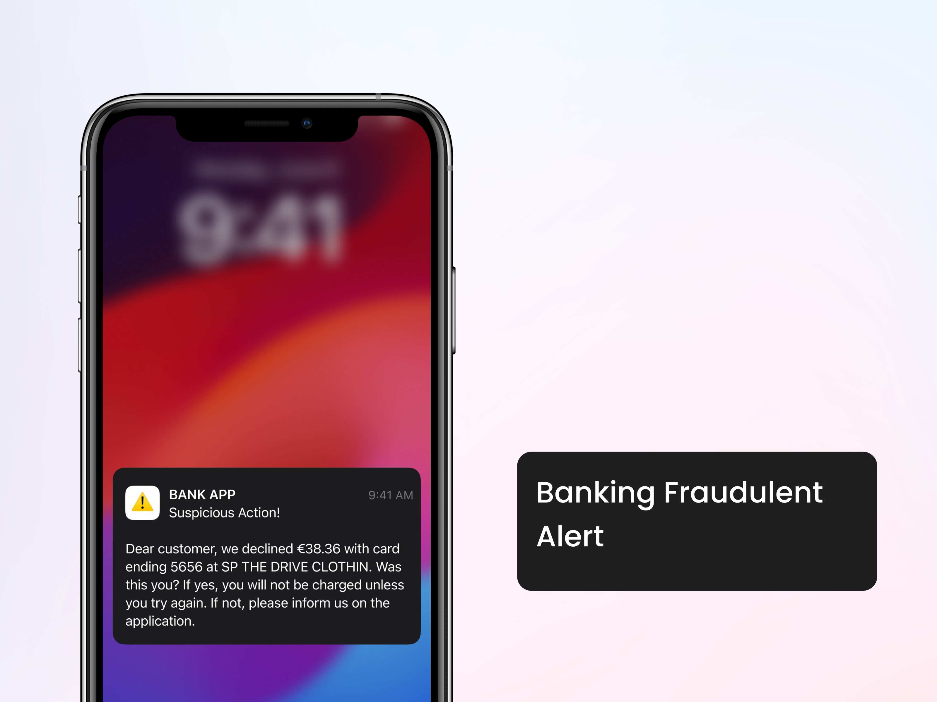
In banking, a feature banks commonly offer is to watch for fraudulent charges. A user will be notified if the bank detects (or suspects a fraudulent charge on credit cards or debit cards).
Problem
A user received 2 notifications from a bank, but wasn’t sure if the notifications were from a legitimate source, or were themselves fraudulent (or spam) notifications.
The user had been receiving and influx of spam text messages, and the email “appeared to be off.” Neither the mobile app or desktop app contained any notifications about fraud. The only way to contact the bank was to make a phone call. This user is a millenial and strongly prefers chat experiences for customer support.
After making a phone call to the bank, the user was able to determine that the notifications were legitimate and was able to inform the bank that the charges were in fact fraud.
After confirming the charges were fraud with the bank, no further notifications were received by the user, leaving her uncertain about what actions the bank was taking (examples might be canceling the account or card, and if so, whether a new account or card were going to be processed).

The Challenge
Improve the customer experience to make it easier for the user to identify that the bank notifications were legitimate.
Improve accessibility to customer service.
Communicate with the user the actions that the bank would take after the fraudulent charges were confirmed.
The Solution
Designing App Notification Flow
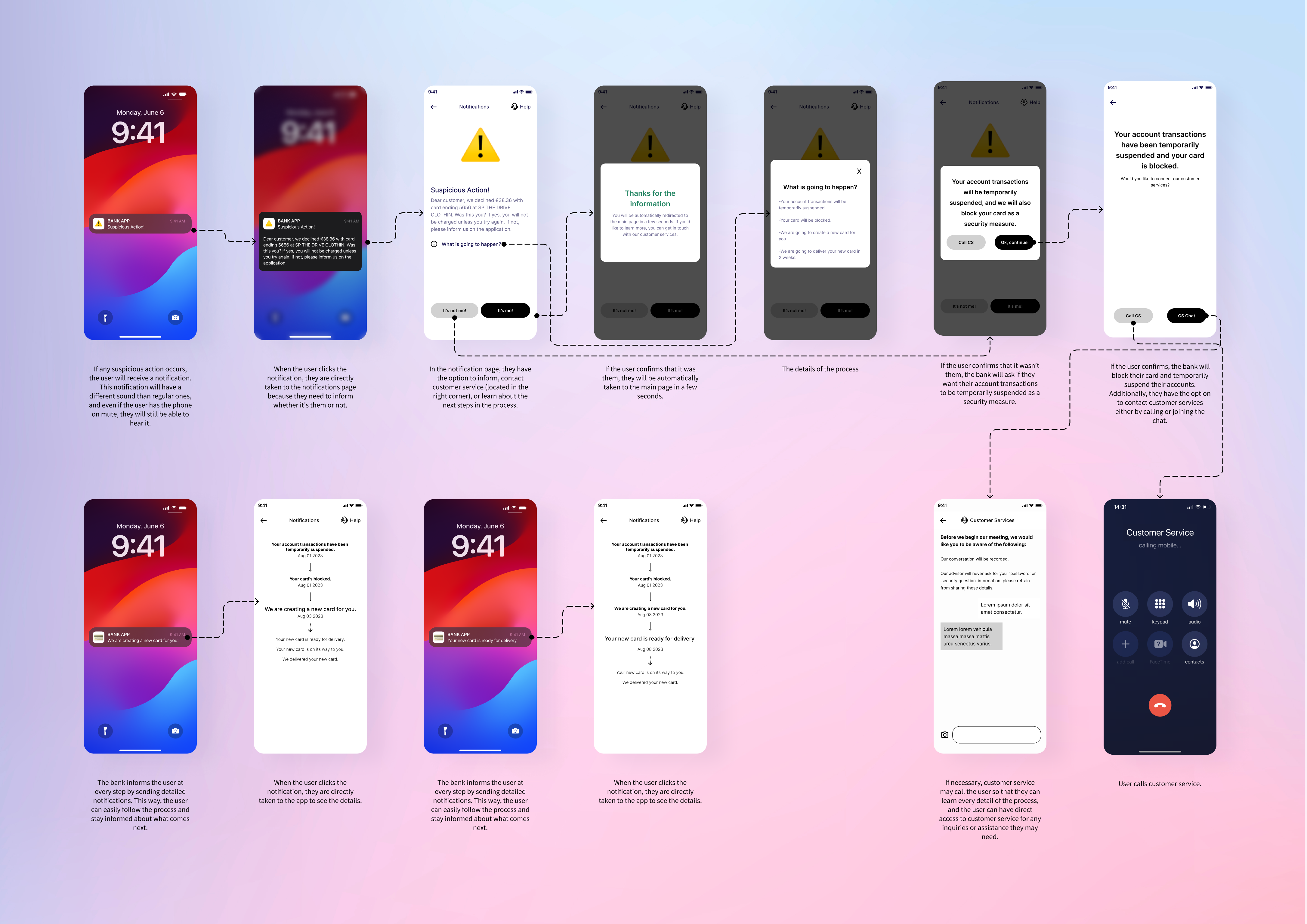
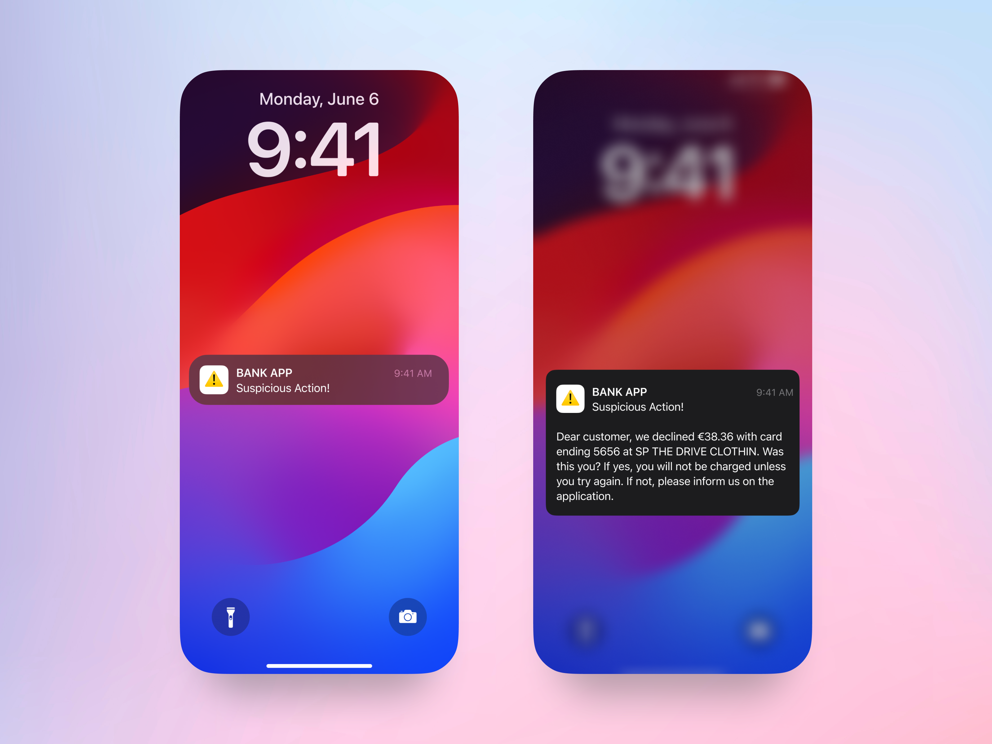
If any suspicious action occurs, the user will receive a notification. This notification will have a different sound than regular ones, and even if the user has the phone on mute, they will still be able to hear it.
When the user clicks the notification, they are directly taken to the notifications page because they need to inform whether it’s them or not.
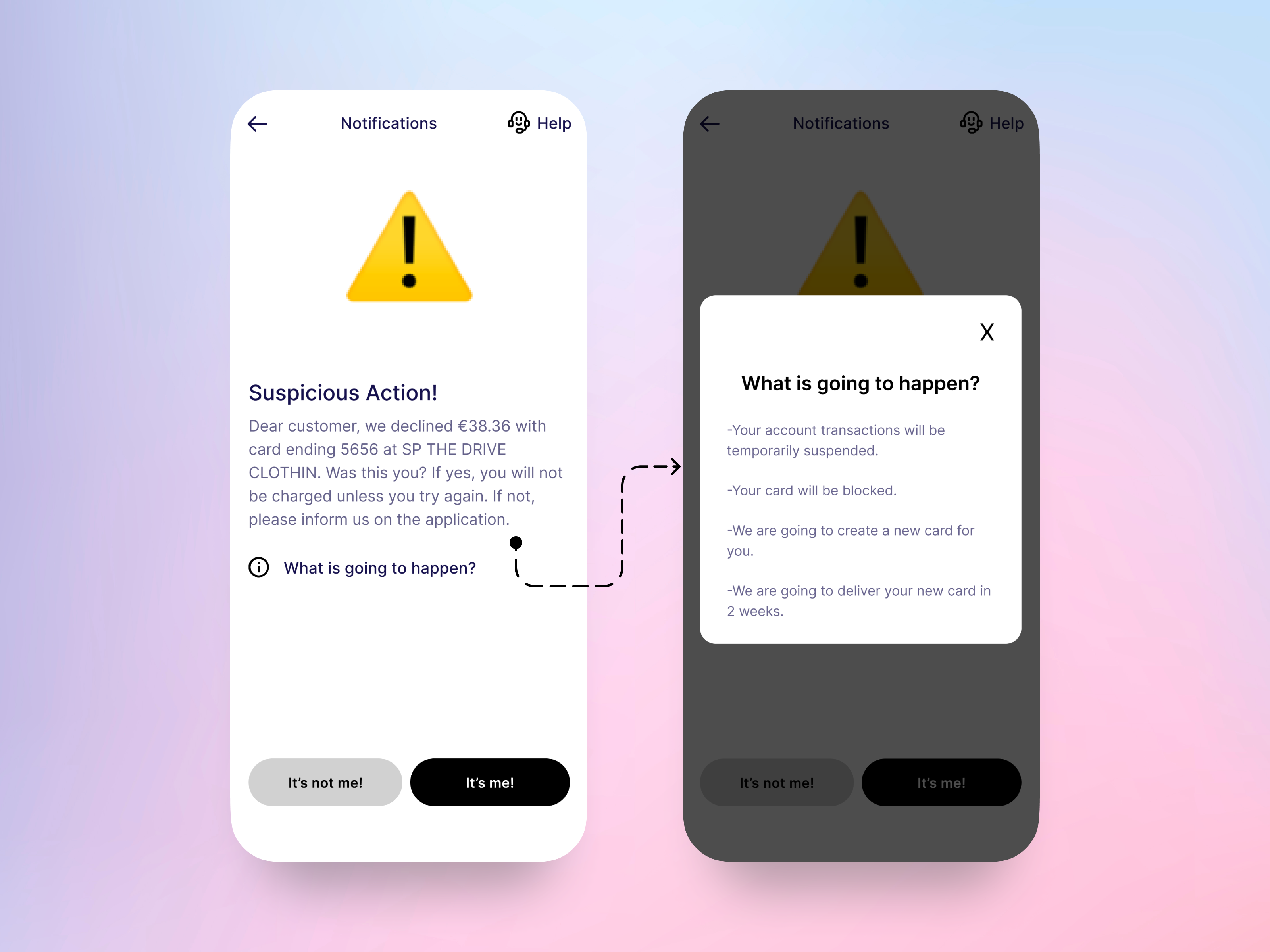
In the notification page, they have the option to inform, contact customer service (located in the right corner), or learn about the next steps in the process.
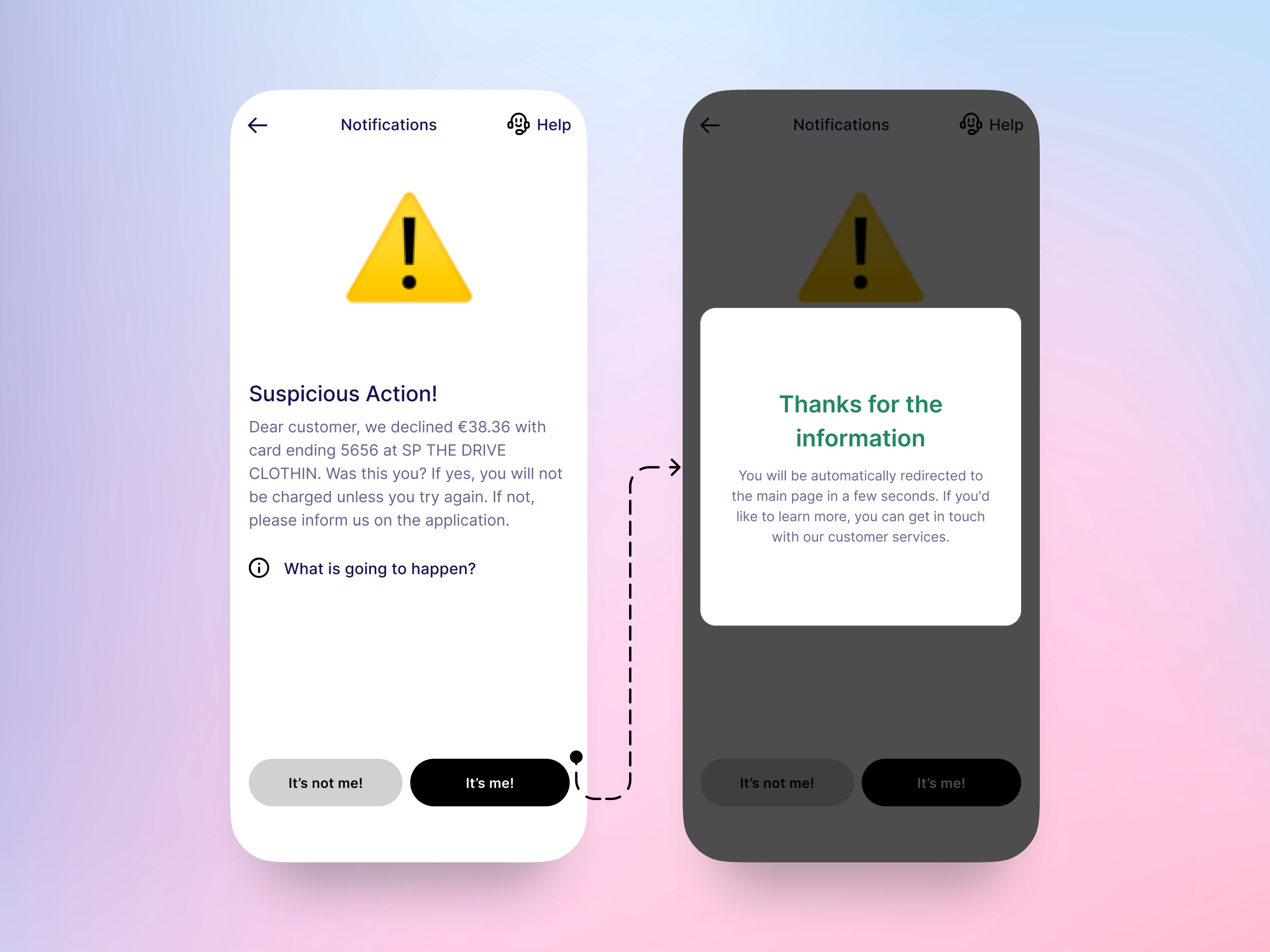
If the user confirms that it was them, they will be automatically taken to the main page in a few seconds.
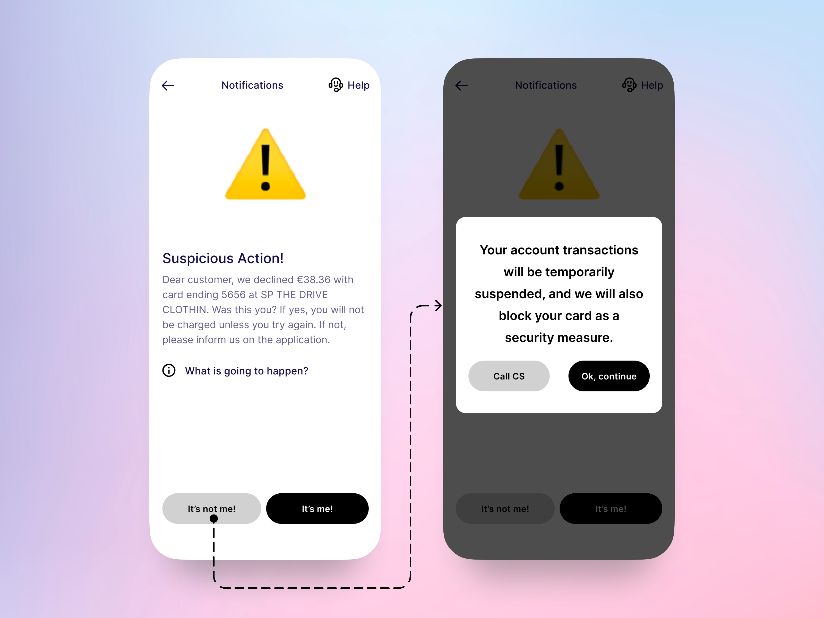
If the user confirms that it wasn’t them, the bank will ask if they want their account transactions to be temporarily suspended as a security measure.
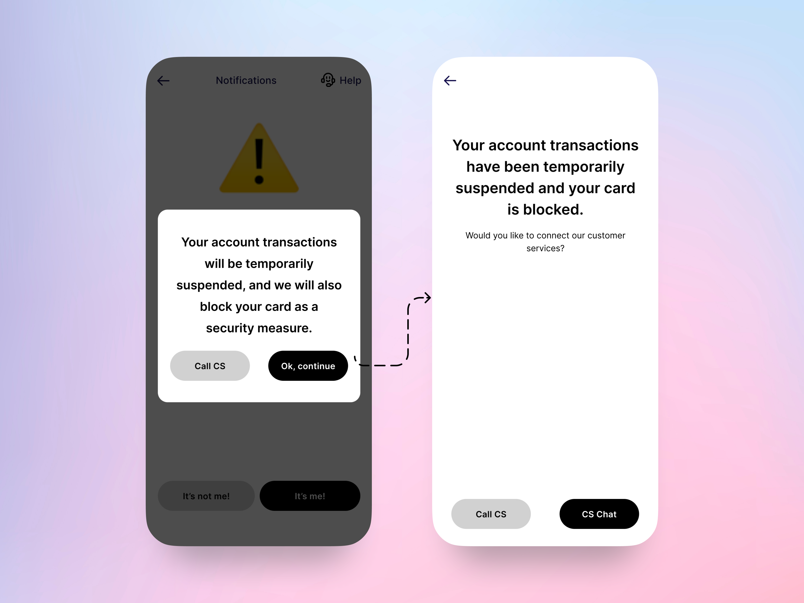
If the user confirms, the bank will block their card and temporarily suspend their accounts. Additionally, they have the option to contact customer services either by calling or joining the chat.
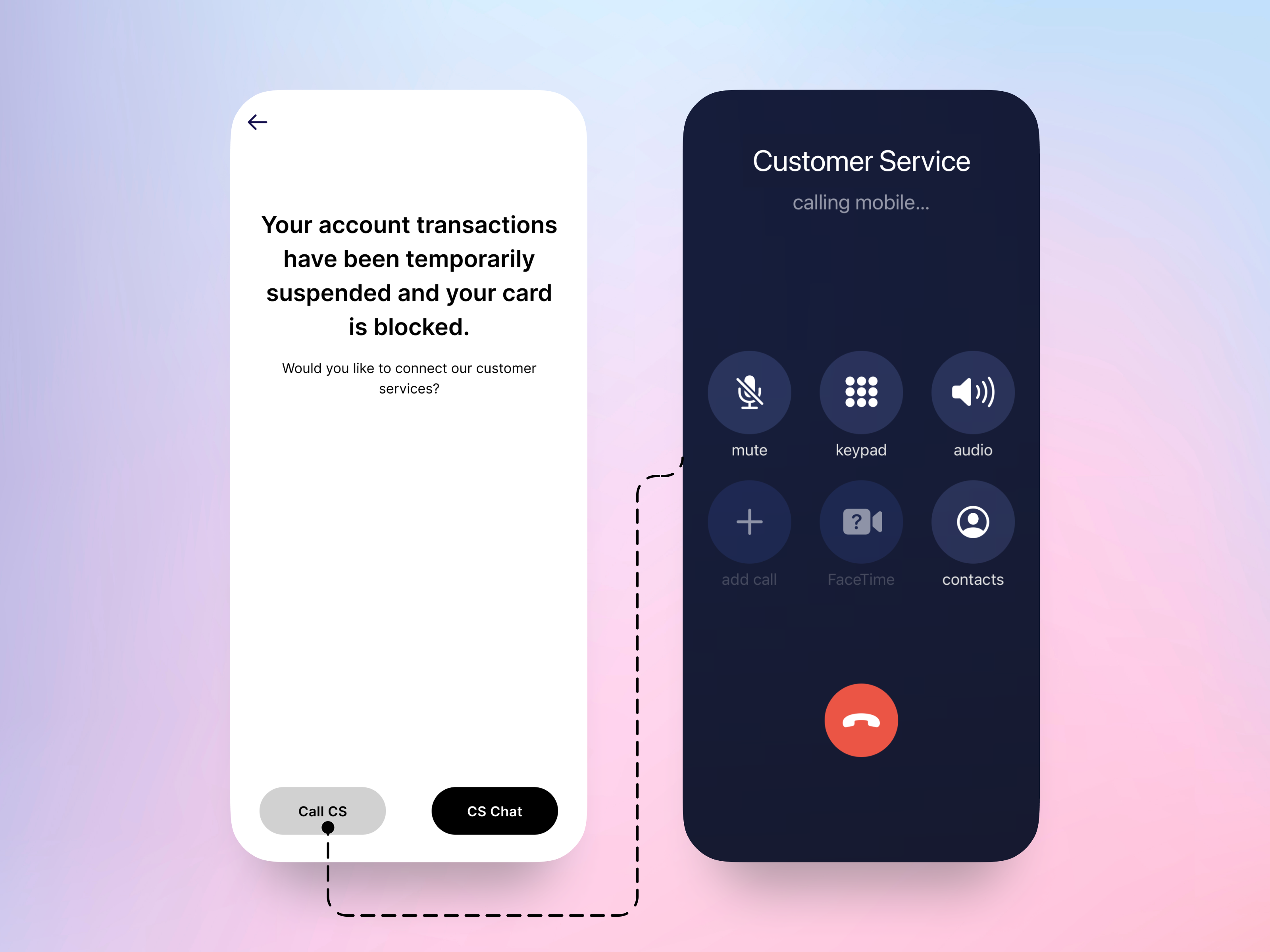
User calls customer service.
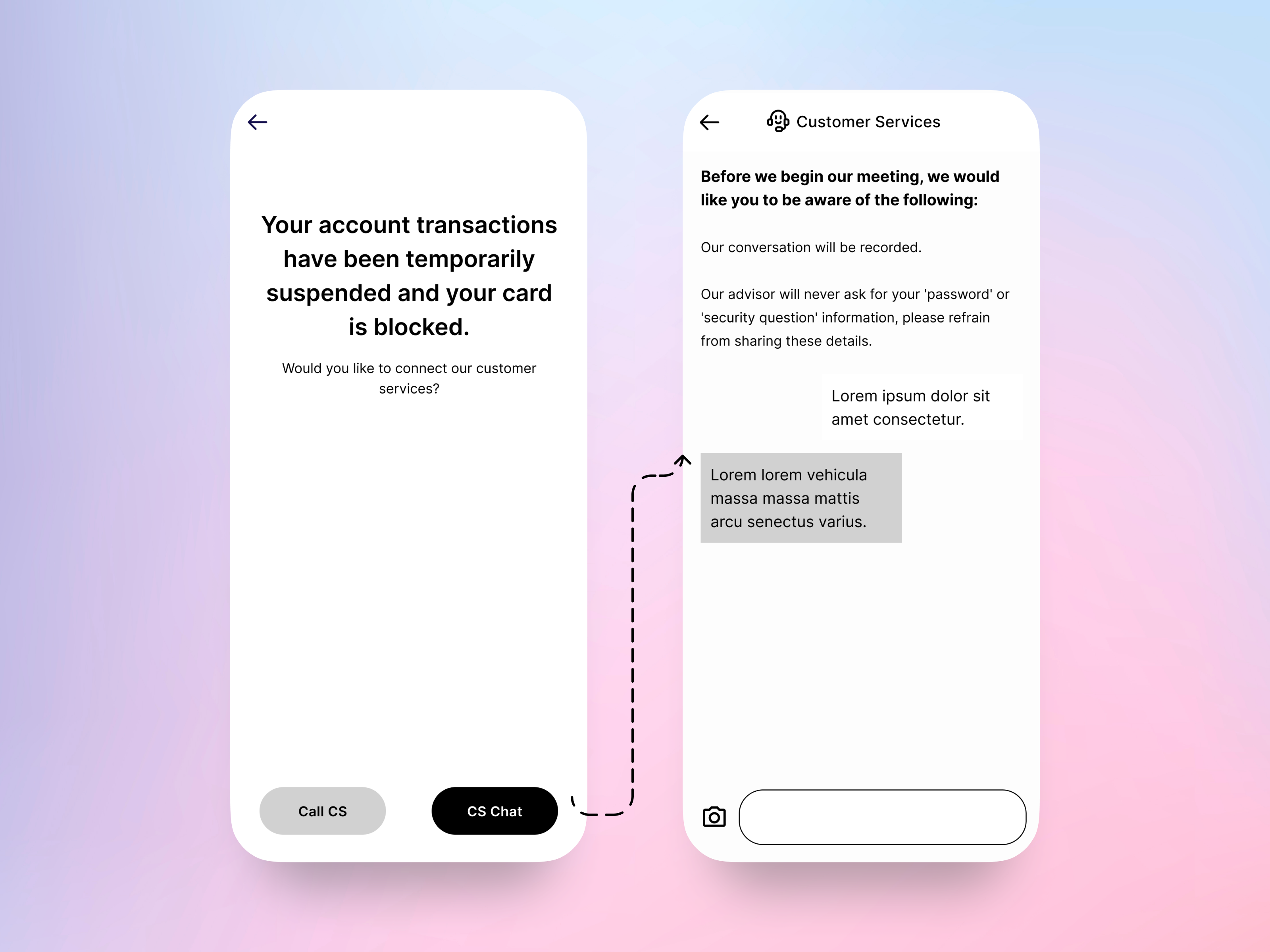
If necessary, customer service may call the user so that they can learn every detail of the process, and the user can have direct access to customer service for any inquiries or assistance they may need.
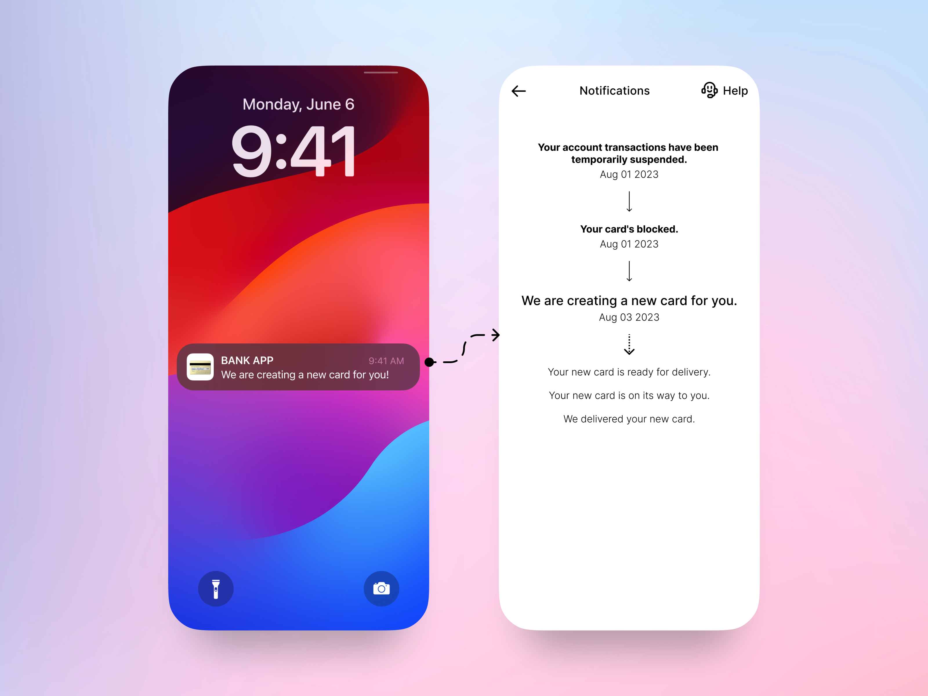
The bank informs the user at every step by sending detailed notifications. This way, the user can easily follow the process and stay informed about what comes next.
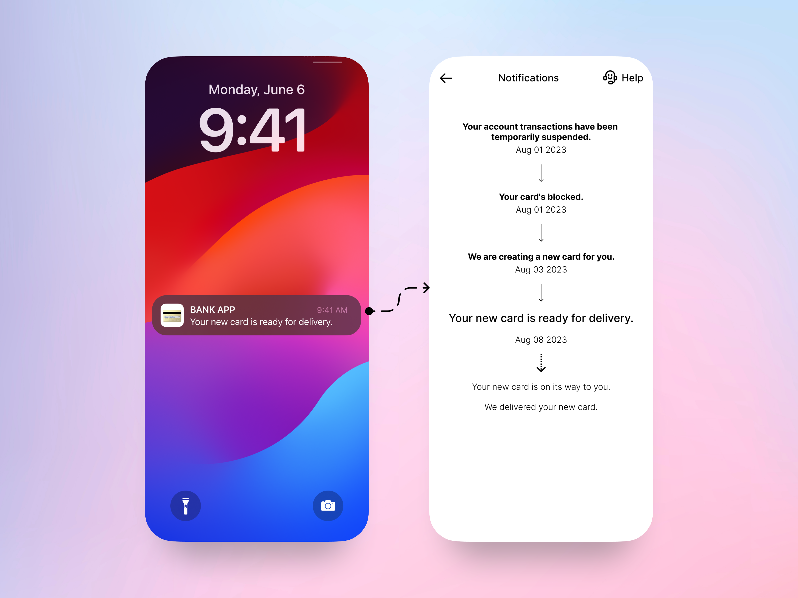
When the user clicks the notification, they are directly taken to the app to see the details.
Improving E-mailing
The previous alert email appeared compressed without proper white space. I undertook a redesign to improve its layout and spacing.
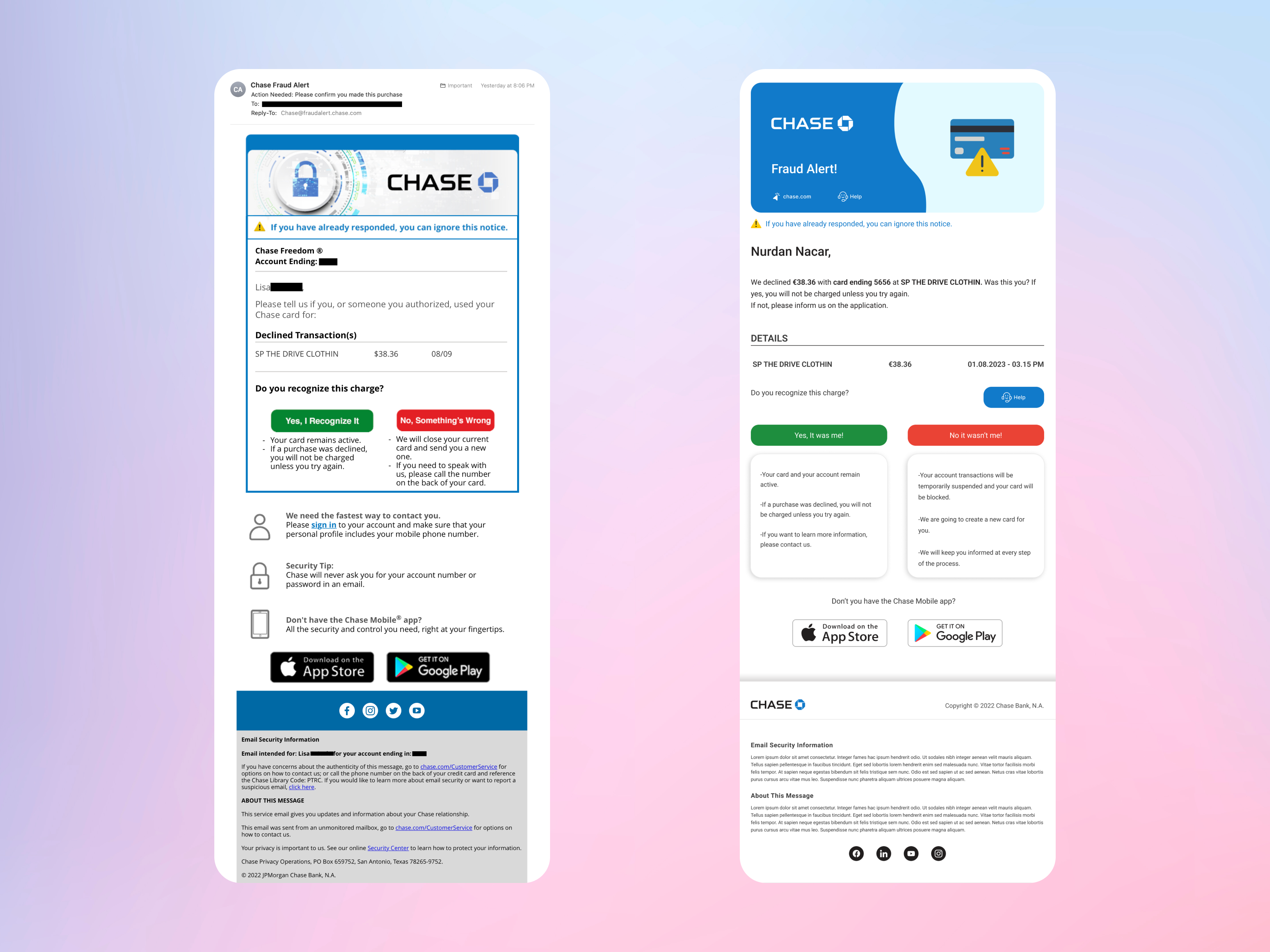
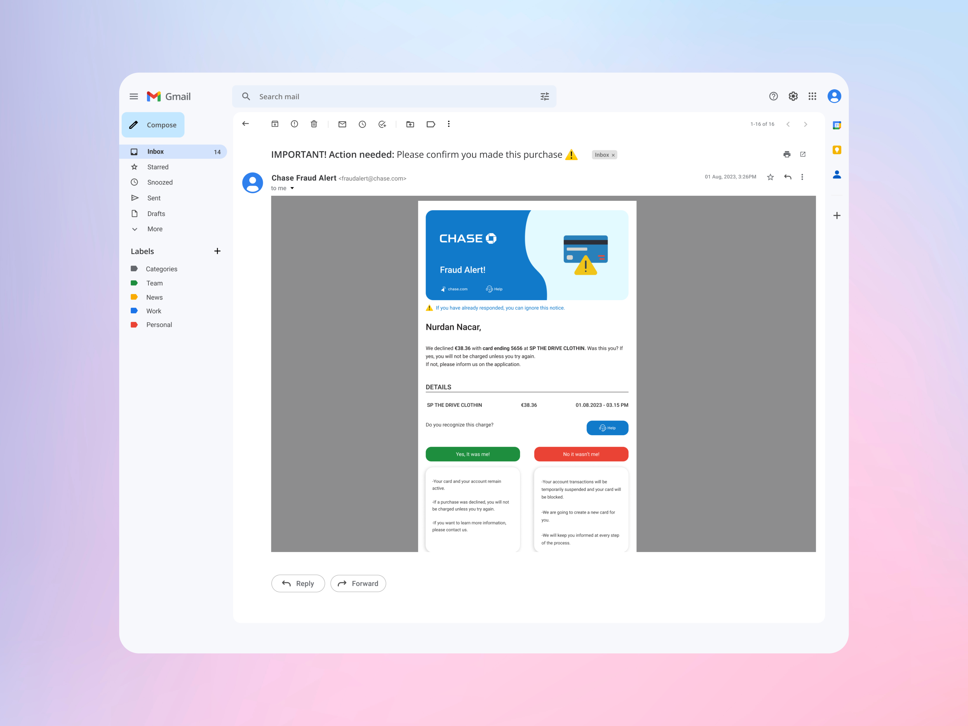
Additionally, users will receive an email for each update, similar to receiving notifications from the app. Indeed, this clear communication approach will establish trust and ensure that users remain well-informed.
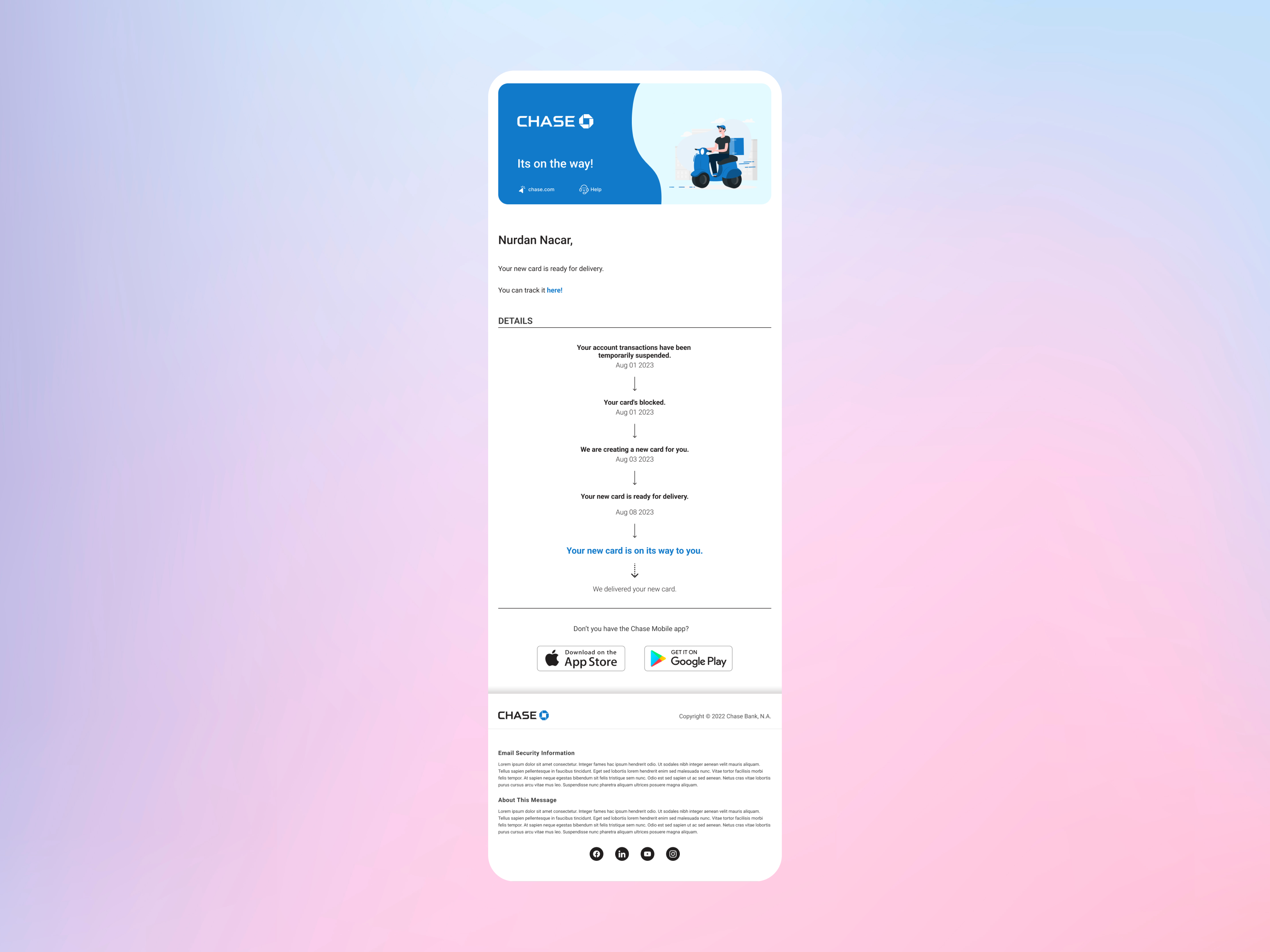
What Was the Challenge, and How Did I Address It?
Improve the customer experience to make it easier for the user to identify that the bank notifications were legitimate.
I reworked how notifications are handled, making it easier for users to tell which bank notifications are genuine. Now, notifications are sent directly from the application, enhancing the overall customer experience. Additionally, I revamped their email design, giving it a fresh appearance with ample space and a more corporate look.
Improve accessibility to customer service.
I added a user-friendly button for quick access to customer support, improving the way users can reach out for assistance. They can now easily call or start a chat with our customer service team, ensuring they get help without any hassle.
Communicate with the user the actions that the bank would take after the fraudulent charges were confirmed.
For clear communication about the bank’s response to confirmed fraudulent charges, I designed a fresh notification process. Users now receive notifications at each step, providing them with detailed updates about the actions taken by the bank.

Did you enjoy my project?
Do you have any questions?